contact | contents | bibliography | illustration credits | ⇦ chapter 2 |
3. ROOM GEOMETRY
Doors and exits
Design guidelines, even when legally codified, cannot possibly cover all of the ways in which rooms or spaces might become dysfunctional. For example, something apparently innocuous, like the position of the office door in the plan shown in figure 3.1a, would make it impossible to accommodate a bookcase like the one shown in figure 3.1b, whose door position anticipates the space necessary for that type of furnishing and thereby increases the room's functionality and flexibility. This can be seen in Sibley Hall, the building connected to Milstein Hall where I had an office for many years. In the digital fabrication lab across the hall from my former office (fig. 3.1a, bottom), large objects such as desks, printers, and laser cutters create an awkward and inefficient space as they converge in front of the door in the room's corner. In order to enter and exit the room through the corner door, twice as much perimeter floor area must be reserved for circulation space as would be the case if the door occupied a position further from the corner, allowing a typical desk or another piece of equipment to squeeze in (compare fig. 3.1a and fig. 3.1b, middle images). In my former office, on the other hand (fig. 3.1b, right), a door opening relatively close to the corner still allows for narrow bookshelves to efficiently occupy the space between door and perpendicular wall.
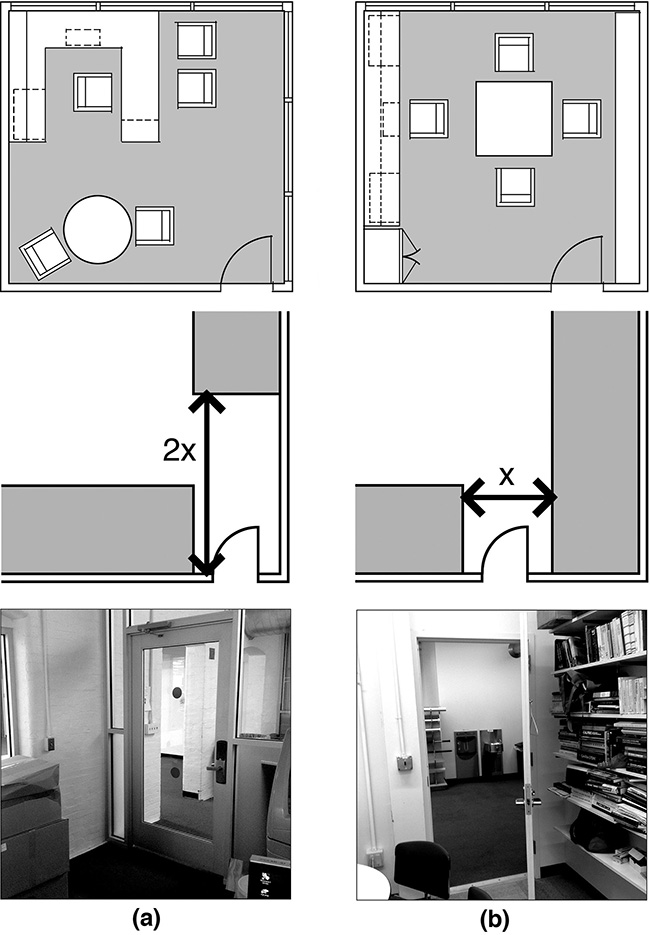
Figure 3.1. The position of a door in a room can affect its functionality, by allowing more or less use of wall space: A door placed at the corner (a) is less efficient than a door moved away from the corner (b); middle diagrams show schematically how more wall space becomes available in case b compared to case a; and photos at the bottom show two rooms representing these two door placement conditions.
Milstein Hall has virtually no rooms with conventional doors, except for a few exit doors, fire-barrier doors, and doors into service/mechanical rooms; and yet the same type of issue still emerges. For example, the exit door from the Crit Room into the auditorium was placed at the corner of the room, leading to frequent problems as people and objects block the fire exit on both sides—portable monitors are moved to the wall on the Crit Room side and chairs are placed against the wall on the auditorium side (fig. 3.2 top). Due to constraints that the geometry of the space places on design reviews, one also discovers a creative (and dangerous) deployment of chairs and models placed precisely in locations blocking both of the room's egress points (fig. 3.2 bottom).
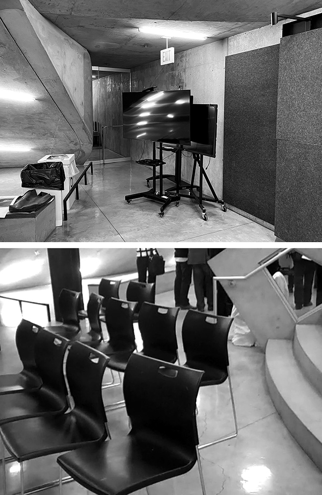
Figure 3.2. Position of exit door in the Milstein Crit Room makes it difficult to productively use the space immediately adjacent to the side wall for monitors and other objects necessary for design reviews, while still providing space for required exit access (top); the lack of clarity about egress paths also encourages the dangerous deployment of seating and presentation material blocking required exits (bottom).
And speaking of egress, it certainly doesn't help matters when highly combustible black foamed plastic solids,1 used as display stands for reviews and exhibits, are stored under the Crit Room stair (fig. 3.3).
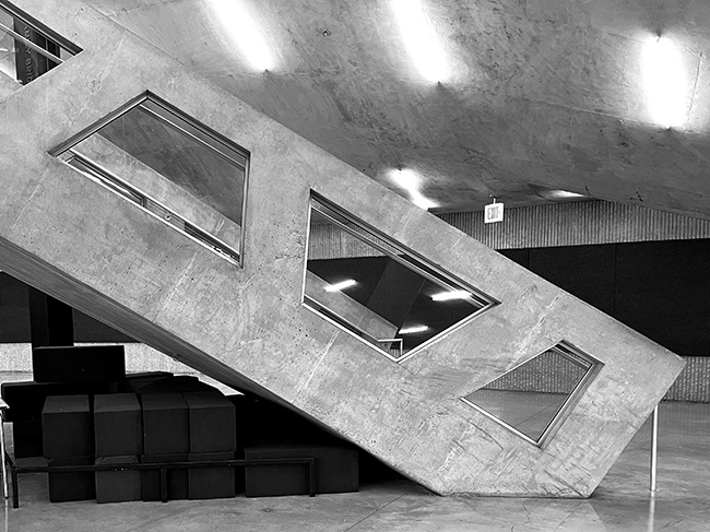
Figure 3.3. Highly combustible foamed plastic display stands are stored under the Crit Room exit stairway.
Similar issues affect the position of the exit door leading to the outdoor stair in Milstein Hall's auditorium, as can be seen in figure 3.4, where—as in the Crit Room—the desire to place objects along the surface of the wall comes into conflict with the position of the door and the circulation required by that position.
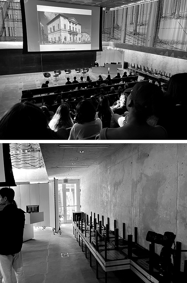
Figure 3.4. Position of an exit door in Milstein Hall's auditorium makes it difficult to productively use the space immediately adjacent to the side wall for either seats or required exit access. Peter Eisenman inaugurates the "Peter Eisenman Lecture Series" (top) on April 26, 2023, with a story about Colin Rowe and a certain Palladian villa projected on the screen, seemingly oblivious to the blocked exit door immediately to his left; the same blocked exit door is viewed from ground level (bottom).
Auditorium dysfunction
The dysfunctional geometry of Milstein Hall's auditorium may well have been exacerbated by two factors: first, the decision to place auditorium seating on the outer surface of a concrete dome enclosing the Crit Room; and second, the peculiar decision to place a set of leather-clad motorized chairs—intended exclusively for infrequent meetings of Cornell's Board of Trustees—at the front of the auditorium. Aside from the bizarre politics that resulted in Milstein Hall's auditorium being used for Board meetings, the underlying premise behind the actual design of these seats is so strange as to defy all efforts aimed at comprehension (fig. 3.5).
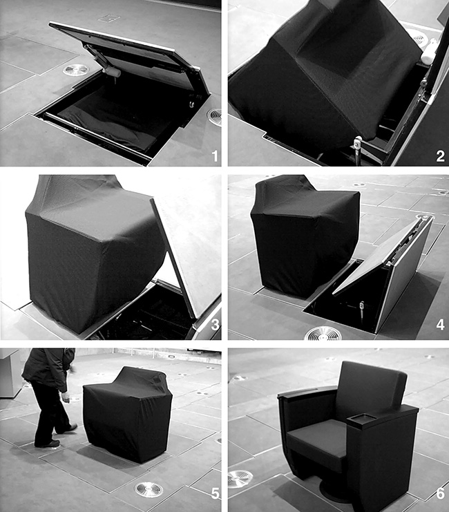
Figure 3.5. "Board of Trustee" seats mechanically rise out of their slumber at the bottom of Milstein Hall's auditorium.
Suffice it to say that comfortable and motorized leather seats are stored under the raised floor of the auditorium for use only three times a year when the Trustees are in town, at which times complex motorized mechanisms are activated and the chairs rise out of their hidden spaces. In a quaintly anachronistic nod to the treatment of royalty (or perhaps to captains of industry), faculty and students—the common people at Cornell—are asked to use ordinary chairs that are moved in from some remote storage location when the Trustees leave Ithaca in their corporate jets.2 But the complex mechanisms that raise and lower the Trustee chairs can easily break down: a panicky email was sent out to students and faculty in May 2013 ("Please note that no one should uncover or sit in the trustee seats for any reason") when some of the leather seats could not be returned to their hidden position, and it was necessary to leave them exposed to the hoi polloi.
The removable rows of "regular" seats that are brought in when the "Trustee" seats get lowered into their below-the-slab home are rarely used, since the sightlines to the projection screen from this part of the auditorium require an uncomfortable and unhealthy tilting of the head relative to the neck (fig. 3.6), well beyond the 15° maximum angle of incline recommended by experts, based on anthropometric data.3 There is also a palpable sense that these lower seats are less desirable, perhaps because—being ad hoc, seemingly temporary, and placed on the same flat floor surface with the lectern—they deny users the anonymity gained by sitting further back on the sloped surface of the dome.
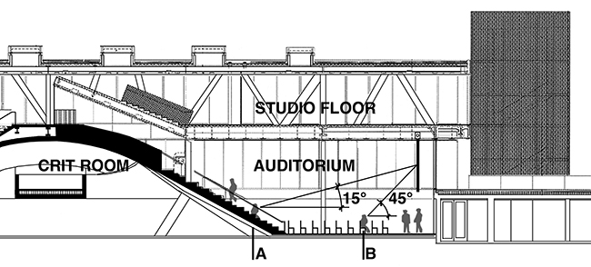
Figure 3.6. The seats at line "A" are the lowest acceptable seats in the auditorium, providing the maximum 15° inclined sightline to the midpoint of the screen; all seats below line "A," e.g., those shown at line "B," are uncomfortable and unhealthy.
Size
A common problem in interior rooms or spaces is inadequate size: difficulty opening a door to a toilet stall because it swings in against the toilet; difficulty leaving your seat at a dining table because there is not enough room behind the seat to easily pass through; difficulty in moving an appliance or large piece of furniture into a room because the door size, or corridor shape, does not accommodate the geometry of the item to be moved; and so on. Making rooms or spaces big—i.e., bigger than they would be to merely satisfy whatever minimum requirements have been calculated for the current function—is therefore an obvious remedy for functional problems of this sort, and also a factor in making a room or space flexible, i.e., able to accommodate different, or unanticipated, functional requirements. Yet "bigness" is also problematic from both a purely functional standpoint as well as an ideological one.
While size solves many problems, it does so by making buildings less efficient, where efficiency is here defined as providing adequate functionality at least cost. To compensate for merely adequate size, greater attention must be paid to various geometric or dimensional relationships within the room or space. Like size, this too has implications for flexibility, since room dimensions, wall geometry, and the position of fixed elements such as doors and windows can make a room not only more, or less, functional, but can also facilitate changes in the room's organization.
Some building geometries and dimensions lend themselves to adaptability better than others.4 This is not to say a single building geometry can be found to accommodate all the activities encountered in modern society: an apartment house, for example, cannot be expected to easily transform into a museum. Still, within a given context, flexibility can be enhanced, rather than constrained, by planning for the types of activities, and their interrelationships, commonly encountered within that context, rather than designing precisely for the activities programmed at that point in time.
Stewart Brand argues, for example, that a small reduction of building width, from 64 feet (19.5 m) to 55 feet (16.8 m), constrains flexibility in typical academic buildings: "MIT's Main Building, which is still the core of the campus, is a web of high, narrow wings 64 feet wide—just right for a wide corridor in the middle, with space for a variety of classrooms, laboratories, and offices on each side. (A later MIT building of 55-foot width was found to be inflexibly restrictive.)"5 On the other hand, such anecdotal observations cannot always be verified: many academic buildings seem to provide adequate space for offices and classrooms—even large lecture halls—with dimensions that are quite a bit smaller than Brand's "optimal" 64 feet (19.5 m). For example, both Rand Hall and Sibley Hall—buildings that connect to Milstein Hall—seem relatively flexible and adaptable with dimensions ranging from 45 feet (13.7 m) to 55 feet (16.7 m) in width.
Nevertheless, size matters, a fact that has led various architects to suggest that simply making things bigger solves many problems involving the anticipation of future needs. This is because whereas a larger space can usually accommodate any and all activities that "fit" inside its envelope—even when those activities require less space than is available—a smaller space can never accommodate activities requiring more space than is available. This much is self-evident, although it should be noted that some activities do require a space of a particular size, and would not function well in a space made arbitrarily bigger for the sole purpose of fostering flexibility. One would not, for example, expect a squash court to function properly if the distance between opposing walls was greater (or smaller) than 32 feet (9.75 m).
A space that is larger than required may indeed accommodate activities that "fit" within it (like the hypothetical squash court), but in doing so may require modifications, i.e., new or altered partitions, ceiling heights, mechanical/electrical services, and so on. Additionally, changes in occupancy may also trigger building code issues (especially related to fire safety and egress) or structural issues. This type of flexibility therefore comes with a cost, since such modifications may not only be expensive, but also may disrupt activities within the building while being implemented. In fact, the cost may be so great that such modifications are precluded, in which case the space's flexibility is to that extent moot.
Robert Venturi suggested that "most buildings should not be designed like a glove that fits every finger exactly, but like a mitten that allows 'wiggle-room'—flexibility—inside."6 In the same vein, Kari Jormakka recounts an argument between Mies van der Rohe and Hugo Häring in which Häring explained a specific architectural geometry on the basis of a careful functional analysis: "Mies, however, rejected such attempts to optimize shape and told his colleague: 'Hugo, just make your rooms big, then you can do everything in them.' Although Mies is obviously right to a degree," writes Jormakka, "it is clear that any room which is equally good for every function is not particularly good for any of them, nor it is [sic] exactly economical."7
Here again, a note of caution is needed: while "bigness" is often useful in accommodating unanticipated functions, there is more to functional flexibility than mere size: issues involving acoustical separation, fire safety, accessibility, structural strength, plumbing, daylight, and so on, may well constrain not only the utility but also the flexibility of even the biggest space.
In Milstein Hall, the articulation of enormous cantilevered rigid frames (called "hybrid trusses" by the engineers and architects) was accomplished by making the floor plate bigger—i.e., by adding gratuitous space between the hybrid trusses and the glazed curtain wall around the entire perimeter of the building. The reasons for adding this unusable perimeter space may have had something to do with moving the lines of structure away from Rand Hall's brick facade in order to provide adequate space for column foundations or possibly to allow Milstein Hall's steel columns, those that support the trusses, to bypass the continuous brick water table at the base of Rand Hall. Perhaps elaborate floor-to-ceiling curtains needed a zone within which they could operate freely (although for reasons I explain below, the curtains are not consistently deployed between the trusses and the curtain wall and, in any case, the space provided is far in excess of what is required for this purpose). Alternatively, perhaps, a freestanding ideological interest in "wasted" space informed this design decision (fig. 3.7).
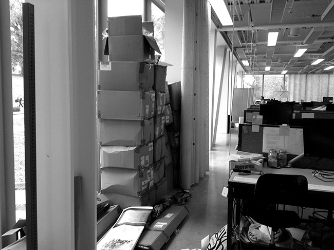
Figure 3.7. Excess space between windows and hybrid trusses in Milstein Hall encourages illicit storage of material.
I make the case in one of my Milstein Hall construction videos8 that the articulation of trusses on the building's east "gateway" side, but not on the building's west side, also betrays an archaic gendered sensibility that creates a zone of wasted space in order to prioritize "masculine" trusses over "feminine" curtains: "The trusses, with their hyper-extended cantilevers, are brought to the foreground in a classic display of heroic and masculine postering while the curtains, assuming the traditional role of the feminine and domestic, are pushed into the background."9
Waste
The potential flexibility of "bigness," in the case of Milstein Hall's studio floor, devolves into the pseudo-flexibility of waste. The space between trusses and glazing, while excessive, is hardly the primary reason for such gross inefficiency. As illustrated in figure 3.8, the programmed space on Milstein Hall's studio floor—including studio classrooms, assembly spaces (wood-floored studio lounge and small stepped auditorium), and worktables—constitutes barely over 55 percent of its 26,442 gross square feet (2,457 square meters), an inefficient and wasteful net to gross ratio. In contrast, the net to gross ratio in Rand Hall, when it served as studio and support spaces—before its conversion into the present Mui Ho Fine Arts Library—was over 80 percent.
Figure 3.8. Rectangles with gray tone outline programmed studio and support spaces in Milstein Hall and Rand Hall (when Rand Hall was used for such purposes, before its conversion into the Fine Arts Library). In computing the net to gross ratio for Milstein Hall, the required bathrooms and exit stairway in Rand Hall are included.
One might think that the large amount of unprogrammed space on the studio floor of Milstein Hall would at least contribute, somehow, to the culture or ambiance of the architecture program, but one would be wrong: these spaces are unused and unloved (fig. 3.9, top). And, unlike the more efficient studio layout previously deployed in Rand Hall, the Milstein layout provides no clues as to the identity of individual studios or the various studio years and programs; no walls or partitions for pinning up drawings or for informal reviews; no control over visual or acoustic privacy; and—even with such an extravagant net to gross floor area ratio—no sense of spaciousness (fig. 3.9, bottom).
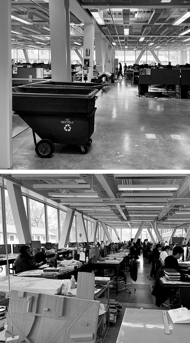
Figure 3.9. Unprogrammed space is unused and unloved (top); and the layout provides neither clues to the identity of individual studios nor partitions for privacy and pin-ups (bottom).
The theory of waste in fashion and architecture has an interesting trajectory, beginning in the mid-nineteenth century with the religious idealism of John Ruskin, reaching a high point in the late-nineteenth- and early-twentieth century with the caustic insights of Thorstein Veblen, and descending to an almost comically servile status with the writings and work of Rem Koolhaas, co-founder and principle intellectual guru of OMA. I describe this trajectory in my book, Building Bad:
For Veblen, addressing ostensibly useful questions is nothing more than a smokescreen employed to soft-sell fashionable (wasteful) content. … "If beauty or comfort is achieved—and it is a more or less fortuitous circumstance if they are—they must be achieved by means and methods that commend themselves to the great economic law of wasted effort."
The idea that waste is an important element of architectural design not only precedes Veblen, but survives, intact, well into the 21st century. But unlike Veblen's negative and caustic analysis, some influential theorists, both before and after him, turn his critique upside-down. John Ruskin, for example, criticizes the "modern" interest in efficiency by extolling the virtues of apparently wasteful expenditures, writing that the "Spirit of Sacrifice . . . is a spirit, for instance, which of two marbles, equally beautiful, applicable and durable, would choose the more costly because it was so, and of two kinds of decoration, equally effective, would choose the more elaborate because it was so, in order that it might in the same compass present more cost and more thought. It is therefore most unreasoning and enthusiastic, and perhaps best negatively defined, as the opposite of the prevalent feeling of modern times, which desires to produce the largest results at the least cost."
On the other hand, the Dutch architect Rem Koolhaas acts more like Veblen's acolyte. Referring to his own work for the luxury Italian fashion house Prada, for example, Koolhaas remarks: "At the time we started collaborating, everything in the world of art and fashion was polished. Everything was smooth, so we felt that Prada must be rough. We put an emphasis on concepts like waste. In real estate terms, the ultimate luxury is wasted space. Compare this with Veblen's "great economic law of wasted effort" in the service of luxury.10
Perhaps the most outrageous expression of elitist waste can be seen in OMA's rendering showing their proposal for an oversized glass-paneled elevator servicing the three floors of Milstein Hall, in which was placed an explicitly useless, but symbolically potent, Barcelona chair (fig. 3.10). As I wrote in a blog post in 2009, before the building was completed and in the wake of the financial meltdown of 2008:
In a stunning, though entirely symbolic, concession to economic pragmatism or, more likely, to mitigate Milstein Hall's apparent extravagance and elitist sensibility at a time when workers are being laid off and faculty salaries are frozen, Cornell has eliminated the symbolic centerpiece of Rem Koolhaas's design for its new architecture building: Ludwig Mies van der Rohe's iconic Barcelona chair has been rendered out of the official rendering of Milstein's glass elevator, replaced with a plain vanilla chair.11
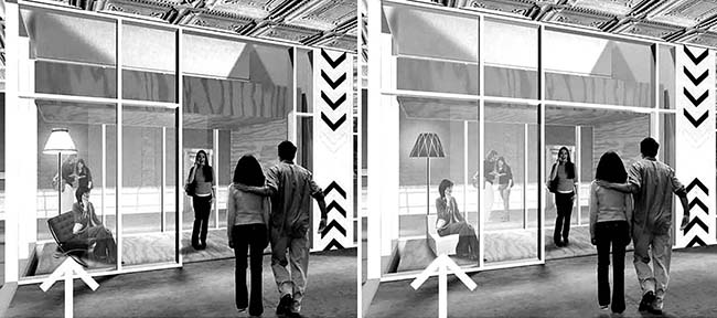
Figure 3.10. OMA's original rendering (left) showing Barcelona chair in the Milstein Hall elevator; this was ultimately replaced with a plain vanilla chair (right). Neither the chair nor the lamp was ever actually purchased and installed (but a floor-mounted electric outlet in the elevator's plywood floor, located precisely where the lamp would have been, survived the budget cuts).
Thus, it is clear that OMA is predisposed to think of waste in positive terms, as a mark of wealth and status ("the ultimate luxury"). What is interesting about reframing "bigness" as "waste" is that, in this transformation, the rationale of increasing minimum spatial requirements to foster flexibility—grounded in a pragmatic functionalism—is replaced with little more than a transparently elitist sensibility. This, then, is the function of wasted space in Milstein Hall: to serve as a didactic clue for architecture students who might otherwise be tempted to search for more socially conscious (politically correct) content as they prepare to join their historically aristocratic profession.
Shape
Many guidelines exist for minimum room dimensions, both in architectural handbooks such as Architectural Graphic Standards as well as in building codes, which provide minimum dimensions for room widths and areas. Handbooks of architectural data tend to be somewhat generic and arbitrary in their determinations of what, exactly, constitutes functional space in various building types. Such handbooks provide useful information about functionality of interior rooms and spaces—mainly in the form of plans, sections, and tabulated data—for common building types based on precedents that capture the conventional wisdom, but do not typically derive from, and cannot necessarily be justified by, a logical theory of function. Building codes, on the other hand, provide only minimum dimensions and areas for rooms, and in written, rather than graphic, form. As an example, the 2002 New York State Building Code, under which Milstein Hall was permitted, requires that "every dwelling unit have at least one room that shall have not less than 150 square feet (13.9 m2) of net floor area. Other habitable rooms except kitchens shall have a net area of not less than 70 square feet (6.5 m2)."12
In such codes and guidelines, it is often assumed that the boundaries of rooms are orthogonal, yet the building code would permit a habitable room to be cylindrical in shape, as long as its diameter was at least 9.44 feet (2.88 meters) to satisfy the minimum area requirement of 70 square feet (6.5 square meters). Orthogonal rooms have the same minimum area requirement, but the smallest plan dimension can be as little as 7.0 feet (2.13 meters). That rooms function better with an orthogonal geometry is fairly well established, but there are some dissenting views. Frank Lloyd Wright, for example, worked extensively with non-orthogonal grids. Speaking about his Hanna House in California, he said: "We call it the Honeycomb House because the structure was fashioned upon a hexagonal unit system. The hexangle is better suited to human movement than the rectangle."13 A similar "organic" argument was made by Adolf Behne about 15 years earlier, in his mid-1920s book on the modern, functional building: "The rectangular room and the straight line are not functional but mechanical creations. If I were to work consistently from biological function, then the rectangular room is nonsensical, for its four corners are unusable dead space. If I were to outline the areas in a room that are actually used and walked upon, then I would inevitably arrive at a curve."14 Yet even Behne was forced to admit that the aggregation of several curved rooms is problematic: "It is correct to say that a single rectangular room is uneconomical, that a curve is a better biological transcription of real usable space. But if it is a matter if arranging several rooms together, the result is different."15
There are essentially three arguments favoring the functionality of right angles. First, vertical walls (i.e., walls perpendicular to a horizontal ground or floor plane) have several functional advantages, as explained by dome "apostate" Lloyd Kahn: "They don't catch dust, rain doesn't sit on them; easy to add to; gravity, not tension, holds them in place. It's easy to build in counters, shelves, arrange furniture, bathtubs, beds. We are 90 degrees to the earth."16 In Milstein Hall, nonvertical walls can be found in the Crit Room (under the "dome"), on the south face of the auditorium and entry, and, therefore, on the north face of the covered arcade. In the Crit Room, sloped surfaces preclude the display of work, and must be isolated from the rest of the space since they would otherwise act as protruding objects. In other words, the slope is both wasteful and dysfunctional (since it prevents both floor area and wall area from being used productively). The sloping curtain wall separating the arcade from the auditorium and entry is similarly wasteful and dysfunctional—for the same reasons—and also must be isolated from the main arcade space by cane-detection guards since it would otherwise protrude into the arcade space in violation of ADA and building code requirements for accessibility. I discuss this aspect of Milstein Hall's dysfunction in the section on accessibility in chapter 6.
Second, things fit well, nest well, and tile well when disciplined by an orthogonal grid. Stewart Brand argues that: "Right-angled shapes nest and tile with each other universally, so tables fit into corners, and clothes into closets, and buildings into city lots, and lots into city blocks." Christopher Alexander is somewhat more lenient about the necessary precision implied by the functional logic of the right angle, but arrives at essentially the same conclusion: "It is an uphill struggle to make an acute angle in a room, which works. … Most often rooms will pack in such a way that angles somewhere near right angles (say between 80 and 100 degrees) make most sense. The reason, simply, is that other obtuse angles do not pack well at corners where several rooms meet."17
Milstein Hall is able to "pack" its nonorthogonal and domed Crit Room into the larger floor plan of the building because it tolerates wasted space on its curved boundary with the adjacent auditorium (fig. 3.11) and because its other neighbor is a mechanical room, whose equipment has sufficient flexibility to accommodate the curve (fig. 3.12). In any case, with structural reinforced concrete loadbearing walls defining the boundaries of this curved space, there is little opportunity to make significant functional or spatial adjustments in the future.
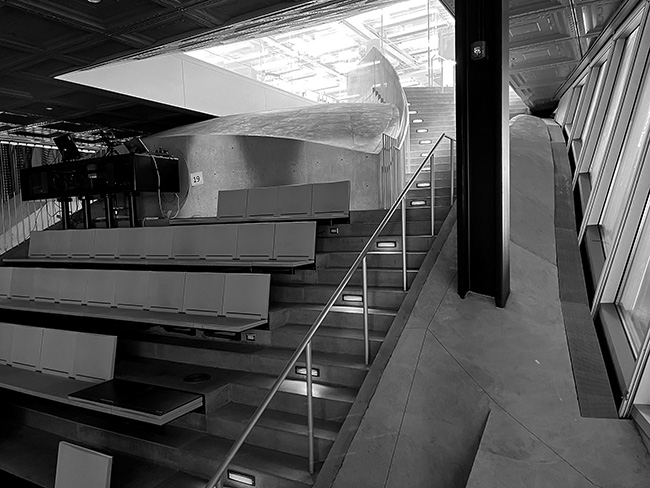
Figure 3.11. Much of the floor area of the Milstein Hall auditorium is unusable because of the way it is cut into the curved surface of the concrete dome; the large space has remarkably little seating capacity.
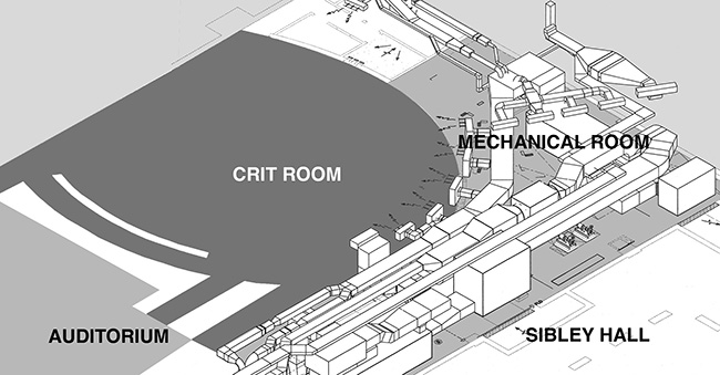
Figure 3.12. Mechanical 3-D diagram (adapted from the Milstein Hall mechanical working drawings by the author).
Third, the straight sides of rectangular buildings can be constructed with straight elements; these, in turn, are intrinsic to manufacturing processes for many building products including float glass, rolled steel, extruded aluminum, sawn lumber, etc. It's not always possible (or easy) to bend and distort the constituent pieces of a total assembly, even if it is increasingly easy to represent such things in drawings or digital models. What is true for surfaces (flat versus bent or curved) is also true for the intersections of surfaces: A right angle connection is always easier to make than one at an acute/obtuse angle. For example, standard connections in structural steel rely on clip angles that are manufactured with right-angled legs; standard joist hangers in light wood framing assume right-angle relationships between joist and girder; standard reusable formwork in reinforced concrete construction, whether for grid-slab floors or intersecting walls, works best within an orthogonal design; and so on. And even if some materials can be bent or curved, difficulties often emerge where "secondary" materials (e.g., baseboards, handrails, copings, etc.) attempt to follow their deviant geometries. Of course, it is possible to overcome such problems with sufficient time, research, and the expenditure of money, but the culture of building in contemporary society works against such careful detailing, as each party involved— architects, consulting engineers, contractors, and their subcontractors— seeks to maximize their profit by reducing the amount of time spent on design research, detailing, and construction.18
Notes
1 I wasn't sure if the foamed plastic display stands under the exit access stairway in Milstein Hall's Crit Room were combustible, since they were not labeled in any way, so I took a small sample home that had detached from one of the older pieces and set it on fire in my driveway. This little adventure is documented on my YouTube video. See Jonathan Ochshorn, "Combustible foamed plastic display stands," here.
2 I can't say for sure how Trustees get to Ithaca, or if they really travel to Ithaca in their "corporate jets." Perhaps some drive, or take the bus.
3 "Rule 5. Vertical Viewing Angle. Students should be limited to 15 degrees maximum head tilt excursion above horizontal, to reference the center of the projection screen." See "Lecture Hall Design Standards University of Maryland, Baltimore County," August 29, 2000, here.
4 Parts of this section are adapted from Ochshorn, "Flexibility and its discontents."
5 Brand, How Buildings Learn, 177.
6 Obrist, "Re-learning from Las Vegas," 155.
7 Jormakka, "The Manhattan Project," 118.
8 Jonathan Ochshorn, "The Construction of Milstein Hall—Part 7 Studio Floor" (video), here.
9 Jonathan Ochshorn, "The Construction of Milstein Hall—Part 7.
10 Ochshorn, Building Bad, 200–201. The quoted passages are as follows: Ruskin, The Seven Lamps of Architecture, 17; Veblen, The Theory of the Leisure Class, 82–83; Koolhaas, see Jack Self, "OMA AMO w/for Prada," 032c, February 16, 2017, here (my italics).
11 Jonathan Ochshorn, "Milstein Hall Loses Its Barcelona Chair," ImpatientSearch (blog), June 30, 2009, here.
12 ICC, New York State Building Code, 2002, 252.
13 Wright, An Organic Architecture, 39.
14 Behne, The Modern Functional Building, 121.
15 Behne, The Modern Functional Building, 129.
16 Lloyd Kahn is quoted in Brand, How Buildings Learn, 60.
17 Alexander, Pattern language, 885–86.
18 "The architect should accept the methods and the elements he already has. He often fails when he attempts per se the search for form hopefully new, and the research for techniques hopefully advanced. Technical innovations require investments in time and skills and money beyond the architect's reach, at least in our kind of society." Venturi, Complexity and Contradiction, 49.
contact | contents | bibliography | illustration credits | ⇦ chapter 2 |